Typography
What is typography?
Typography is the art and technique of arranging type. Typography differs according to the genre and general tone of the film. The typography in a thriller film would have an discomforting effect on the audience, this is due to the size, colour, font of the text. The typography is extremely vital to the film opening as it gives the audience a chilling response and to build suspense.
Typography is the art and technique of arranging type. Typography differs according to the genre and general tone of the film. The typography in a thriller film would have an discomforting effect on the audience, this is due to the size, colour, font of the text. The typography is extremely vital to the film opening as it gives the audience a chilling response and to build suspense.
Typography and connotations
Thriller:

In Prisoners (2013), the typography in the title of the film is simple and is in a white colour, this connotes innocence. The font is in all caps to grab the attention of the audience and inside the letter 'O' there is the design of a maze, this connotes mystery and not being able to find a way out. This is related to the name of the film. The maze is also a clue for the audience to try and found out what film is about.
Action:

In contrast to Prisoners, Kingsman (2014) the action film has a very professional looking title. It uses two colours, gold and white, with a black background. The gold in the word "Kingsman" connotes that this word has a lot of value and is the main title of the film, it could also be a possible name of a franchise. The letters are quite spaced out to make it clear to the audience that the film will have a professional setting. The sizing of the typography is also different as the main title of the film 'Kingsman' is what the film should be remembered for as created by the production company. The letters are very easy to read and the title therefore looks as if it is referring to a company of some sort.
Adventure:

In this logo for Pirates of the Caribbean: On Stranger Tides (2011), there is use of many different images and font sizes for effect as it is an adventure film. A lot is going on in the title which also shows a lot going on in the film. There is an image of a scroll behind the text and an image of a skull with swords through it in the middle. The skull could connote death, as well as the two words connoting violence, this shows that the film will have violence and death in it, and therefore will attract the appropriate audiences who are interested in these themes. This gives the audience clues to what the film is going to be about and the production company have used iconography in their title for effect. The colour of the text is a brown colour, possibly symbolising earth or dirt, as in adventure films there is a lot of travelling involved. As the bigger text is more visible, it is evident that it is the name of a franchise, meaning there are other films with the same name, possibly sequels or prequels.
Thriller:

In Prisoners (2013), the typography in the title of the film is simple and is in a white colour, this connotes innocence. The font is in all caps to grab the attention of the audience and inside the letter 'O' there is the design of a maze, this connotes mystery and not being able to find a way out. This is related to the name of the film. The maze is also a clue for the audience to try and found out what film is about.
Action:
In contrast to Prisoners, Kingsman (2014) the action film has a very professional looking title. It uses two colours, gold and white, with a black background. The gold in the word "Kingsman" connotes that this word has a lot of value and is the main title of the film, it could also be a possible name of a franchise. The letters are quite spaced out to make it clear to the audience that the film will have a professional setting. The sizing of the typography is also different as the main title of the film 'Kingsman' is what the film should be remembered for as created by the production company. The letters are very easy to read and the title therefore looks as if it is referring to a company of some sort.
Adventure:
In this logo for Pirates of the Caribbean: On Stranger Tides (2011), there is use of many different images and font sizes for effect as it is an adventure film. A lot is going on in the title which also shows a lot going on in the film. There is an image of a scroll behind the text and an image of a skull with swords through it in the middle. The skull could connote death, as well as the two words connoting violence, this shows that the film will have violence and death in it, and therefore will attract the appropriate audiences who are interested in these themes. This gives the audience clues to what the film is going to be about and the production company have used iconography in their title for effect. The colour of the text is a brown colour, possibly symbolising earth or dirt, as in adventure films there is a lot of travelling involved. As the bigger text is more visible, it is evident that it is the name of a franchise, meaning there are other films with the same name, possibly sequels or prequels.
Typography and thrillers

The typography in the film The Blair Witch Project (1999) is very simple yet the way it is presented is to give the audience a frightened reaction. The font is white on a black background which is used to create fear amongst the audience as well as the title being on two different lines for emphasis on 'THE BLAIR WITCH'. This is to inform the audience as to what they will be looking for in the film.

The typography from the film Sinister (2012) makes it clear that it is a thriller film. The font is in the colour black on a white background to suggest that it is interrupting the purity of the white background. This would give the audience a horrific reaction and make them feel uneasy, the word 'Sinister' is also in capital letters and it slightly blurred, depicting that it is spreading or it is not stable.
Analysis
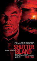

These critically acclaimed thriller films both use different types of typography to connote danger, excitement and mystery with their logos. The typography used for Shutter Island is in capital letters and in red. The red can connote danger or violence, causing distress amongst the audience. It is also on a black background which promotes darkness and this keeps the audience frightened. The typography from Lucky Number Slevin also connotes danger and suspense. This is due to the large white font on the black background. Also the letter "L" has been turned upside down to possible connote a gun or the number 7 upside down. This suggests instability and mystery.


These critically acclaimed thriller films both use different types of typography to connote danger, excitement and mystery with their logos. The typography used for Shutter Island is in capital letters and in red. The red can connote danger or violence, causing distress amongst the audience. It is also on a black background which promotes darkness and this keeps the audience frightened. The typography from Lucky Number Slevin also connotes danger and suspense. This is due to the large white font on the black background. Also the letter "L" has been turned upside down to possible connote a gun or the number 7 upside down. This suggests instability and mystery.
Conclusion
I have come to the conclusion that I use most likely will be using large white font on a black background, also in large size. This is because this is the most common in thrillers and it brings out the most effective reaction from the audience, I would want them to feel scared and intrigued for my thriller opening. The colours I use will connote danger, death and violence which will be the themes that will be incorporated into my opening.
I have come to the conclusion that I use most likely will be using large white font on a black background, also in large size. This is because this is the most common in thrillers and it brings out the most effective reaction from the audience, I would want them to feel scared and intrigued for my thriller opening. The colours I use will connote danger, death and violence which will be the themes that will be incorporated into my opening.
There is a proficient understanding of the different typographies used in films and their impact on the audience. There is a proficient range of examples included.
ReplyDelete- For your action example, what are the connotations of the typography style and colour.
- For your adventure example, what are the connotations of the typography style and colour.
- Provide another thriller sub-genre example.
- In your analysis section, again discuss the style of the typography and the connotations.
- In your conclusion, what style of typography will you use in your thriller opening?
Thanks Miss, I have made these changes.
ReplyDeleteGood work. This is now an excellent post.
ReplyDelete